-30-

Archive for the ‘Design’ Category

Veterans Day

In Design, IDS, Multimedia on November 11, 2010 at 5:06 pm

Congratulations, Biz Carson and Tom Miller! The 21st Century Soldiers project turned out fantastic. Check out the content that ran in the IDS.

BIZ CARSON (IDS)

The finger that flips through the textbook used to rest on a trigger.  The hand that rises in class to ask a question once saluted an officer. The feet that walk through Dunn Meadow used to patrol door to door in Iraq.

Hundreds of student veterans walk among us on this campus. They sit next to you in Spanish, behind you in W131 or in front of you in finite.

We remember the troops. We remember the war. But we’ve forgotten the soldier.

The nation never welcomed these men and women home. There isn’t a victory to celebrate. There still isn’t an end in sight.

These soldiers come and go through the classrooms in Bloomington, just small drops in the ocean of students.

You wouldn’t look twice if you passed one on the street. You probably already have.

These are 21st Century Soldiers.

Also, click through the multimedia component.

What did you think of the final project? Share your thoughts.

The Shepherd’s Lamb

In Design, IDS, Inside on November 10, 2010 at 8:34 am

DANIELLE PAQUETTE (INSIDE)

“Martha,” Jed calls, turning to his daughter. “Why don’t you talk some sense into these kids?”

She hears herself swallow.

She hates the sound. She hopes her voice is clear, steady. She approaches her peers slowly. She wishes someone would ask a question. “Wink if you need help,” one student hisses from the front row. “You can tell us if he’s hurting you or something.”

“He’s not hurting me,” she says. “I believe everything my dad is saying.”

She always has.

That’s the funny thing about truth, she says. You know it when you hear it, like you’ve always known it.

All screaming abates, as though students in the crowd realize something remarkable: Brother Jed is somebody’s father.

“OK, let’s not make fun of her,” another says. “Let’s just be real. Martha, do you play Halo?”

“Yes,” she giggles. “I do.”

“What’s your favorite weapon?”

“The gravity hammer,” she says.

“So you’re kind of normal?” one student asks.

“Yeah, I think so.”

Election Day

In Design, IDS on November 2, 2010 at 10:08 am

It’s every journalist’s favorite and least favorite day of the year – election day! Take a look at some of the stories that ran in the IDS today. If you’re following the election coverage, post your thoughts on what we’ve done well and how we can improve.

Pros:

  • It’s simple. Readers can quickly browse the candidates and learn a little bit about each of them.
  • It’s so much better than a long, text-heavy story about election day.
  • It could be used as a voter’s guide.
  • Lots of plusses to the website and extra election coverage.
  • At first I thought that the location blurbs – “Will be in Indianapolis on Tuesday” – were somewhat pointless. Then I saw this one:  “Will be at Kilroy’s on Kirkwood on Tuesday.” I love any mention of $2 Tuesdays.

Cons:

  • No mention of election day on the front page. Readers might have interpreted this as just another election story.
  • No mention of the issues. Would this graphic have worked better/the same/worse if the IDS had listed information about the issues?

I also liked this ASF about how and where to vote.


What do you think? What would you have liked to see on the front page today? Do you like the election coverage?

Design awards

In Awards, Design, Inside on November 1, 2010 at 1:53 pm

Larry Buchanan won a bunch of ACP Design of the Year awards last week. Check out the designs.

Inside magazine Music Issue spread (Second Place, Yearbook/Magazine Page/Spread)


Inside magazine Music Issue cover (First place, Newsmagazine/Special Section Cover)


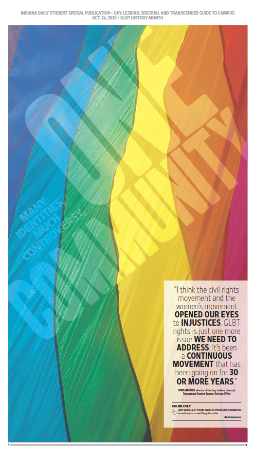
Little 500 Guide, Indiana Daily Student (Honorable Mention, Newsmagazine/Special Section Cover)


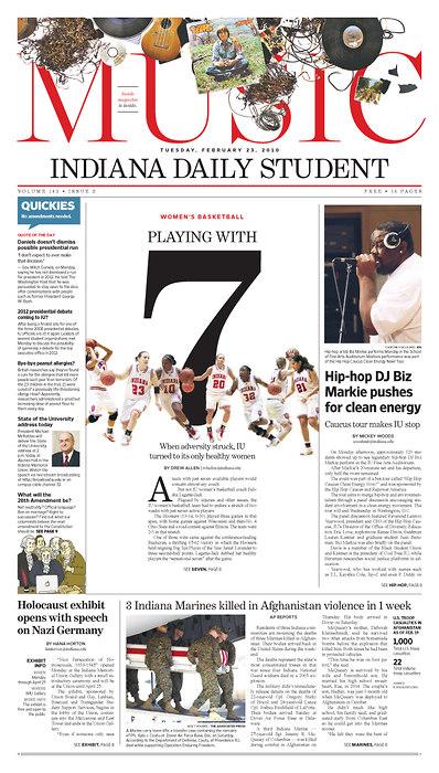
Indiana Daily Student P1 (Honorable Mention, Newspaper Page One)

Charles Apple: Indiana Daily Student having fun with Halloween

In Design, IDS, Inside, Weekend on October 28, 2010 at 2:40 pm

Check out what Charles Apple had to say about the pumpkin and zombie pages in the IDS. Way to go IDS, Inside and Weekend!

Happy Halloween

In Design, Weekend on October 28, 2010 at 5:30 am

Thank you, Weekend, for teaching me how to survive a zombie apocalypse! This is one of the coolest packages I’ve seen in a long time. Nice, funny copy by the Weekend writers and clever art by the Buchanan brothers.

BAILEY LOOSEMORE, ADAM LUKACH, DREW GREAVES (WEEKEND)

If you go here, you’ll live

Eigenmann Hall — The residence center has a C-store with nonperishable foods as well as a kitchen. It also has Outdoor Adventures where you can find weapons — bows and arrows and such.

Apartments on Kirkwood — A lot of the apartments above restaurants on Kirkwood have hidden staircases. If you could find an apartment with two exits and a way to get to the roof, you’d be solid.

Fire station — Fire stations have all the necessities plus big fire trucks that you can trick out into massive zombie-killing machines. Block off all the sides of the truck and use the roof or eyeholes to shoot zombies as you go. And feel free to grab some guns from the police station.

If you go here, you’ll die

Kilroy’s — You’ve seen “Shaun of the Dead;” therefore, you know bars aren’t a good place to hideout. There are no weapons, there’s no substantial food and there’s the bro in the corner who’s talking about how he laid some zombie chick the night before. Do not go there.

Ballantine/Wells Library — Both buildings are huge and have numerous places to hide, but they don’t have enough food, weapons or other essentials. Wells would be a better fit, with the cafeteria in the basement and the food kiosk on the first floor, but unless you want to kill zombies with a pile of books, I’d head somewhere else.

A basement — You might think locking yourself down in a basement with a bunch of provisions is a good idea, but you’re putting yourself in an inescapable corner. Basements only have one exit, and zombies can sometimes be smarter than you think, especially if they’re the diseased-ridden ones and not the slow, dead ones.

I love this section because everything is tied to campus. Even the trading cards were designed to depict “the zombies of Bloomington.” This one was my favorite:

Dude Who Jogs Shirtless on Campus in the Middle of the Day Zombie
The same self-confidence and uber-aggressive nature that allows him, dripping with sweat, to push past you as you’re walking to class will make him a successful zombie. As the saying goes, hunting man-flesh is 10 percent skill and 90 percent attitude. Plus, his ability to ignore the crowds of people that his jogging route takes him through so he can show off his abs translates directly to an ability to ignore the sunlight that’s melting his skin as he chases you down.

Design: four fronts

In Design, IDS, Inside on October 26, 2010 at 9:02 am

One IDS. Four fronts. All beautiful.

Which one do you like best?

Gold coins

In Design, IDS, Multimedia on October 25, 2010 at 11:14 am

Roy Peter Clark talks about the gold coins that keep readers moving through a story.

Place gold coins along the path. Don’t load all your best stuff high in the story. Space special effects throughout the story, encouraging readers to find them and be delighted by them.

That’s a great tool for individual stories, but I think we can apply the same concept to a publication. I love it when each page of the paper has something memorable – a thoughtful headline, clever lede, or nice photo. It makes me want to read the entire paper. Here are some gold coins I found in the IDS today. Feel free to post your own.

Weekend front

In Design, Weekend on October 21, 2010 at 8:05 pm

Weekend always has nice section fronts. I’m a big fan of the illustration and headline on this page. The two elements really capture the spirit of the story and pull together the package. I’m not sure how I feel about putting a Passion Pit blurb at the bottom of the page. The “exclusive Q&A” will probably attract readers, but does it take away from the rest of the design? Let me know what you think.

Design critique

In Design, IDS on October 20, 2010 at 10:43 am

Here’s the opinion front from 10/19/2010.

I like that the designer tried divided information into sections (smart phones, office supplies, etc.) Too often this kind of information would get stuck in a long story. The circles describing initiatives and overhead helped convey information, but there were so many percentages on the page that I didn’t exactly understand what the graphic meant.

Designers, what do you think? What would you change?

Everyone else, did this design help you better understand the content? Did it distract you?